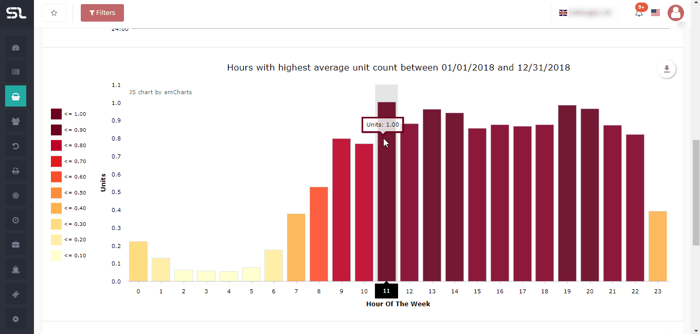
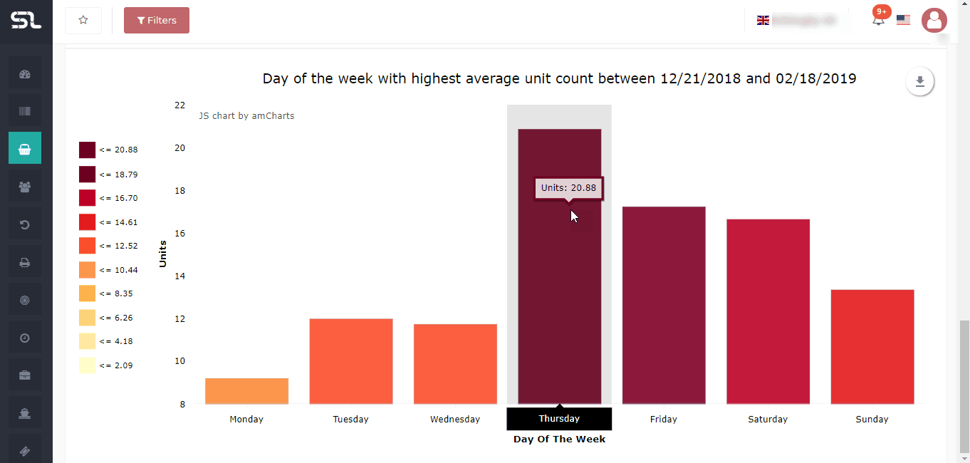
To know which days of the week and which hours of the day are the most profitable or popular in a chart view.
To get a visual representation of your order density distributed over days of the week and within the days of the week, the hours in the day.
How does it work?
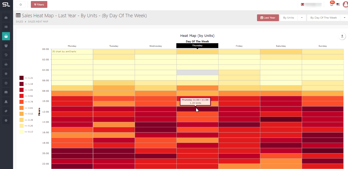
The sales heat map is a rectangular grid with a series of individual cells, each cell represents an hour of the day. The hours are organized by days of the week.
The intensity of the color of an hourly cell will depend on how many sales have been placed here in the hour that the Sun represents.
The more sales in that hour, the darker the color of the cell. The fewer the sales, the lighter the color of the cell.
All the data of the heat map comes from the order date column of the order screen.
Hovering over any cell will tell you the exact value.
The sales heat map represents the timezone of the selected market place. (GMT for UK, GMT+1 rest of EU, PST/PDT for US).
Screen Print
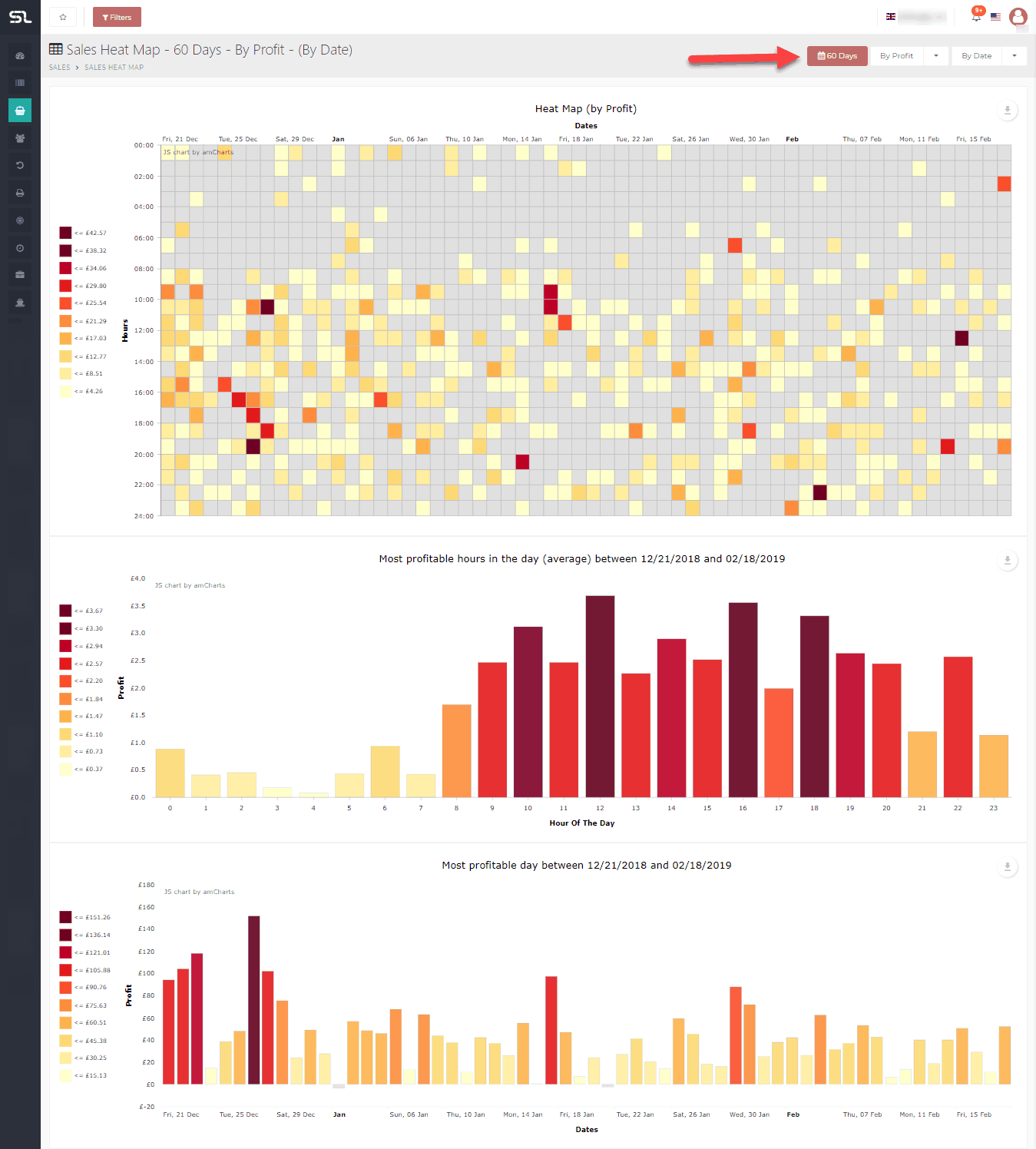
Now let’s take an example to further clarification. Let’s say we want to get the results of the past two months and sort them by date and by profit. Don’t be scared, we will go step by step.
Step 1: Click on the Date Picker and select the option of 60 days.
Step 2: Change from sort by Units to sort by profit.
Step 3: Change from sort by Day of the week to sort by Date.